My
product and ancillary texts combined with each other at overall effect very
well. I kept the continuity of my house style in each of my products, as both
my video and ancillary texts are presented in black and white noir theme. At
the beginning of creating my ancillary texts I took large amount of images of Kevin,
which was the simplest task from all. Afterwards, I needed to make a decision
which of these images would reflect and match my video in best way. I concluded
with images taken from photo session and the screenshot from actual video.
I tried a numerous different font styles
within the images, to make sure I would use the appropriate one which matches
the theme and genre of my music video. I placed the text below the artist as I
decided that it would highlight his importance and match the house style of the
rest of my ancillary texts. I had separate the name and surname of my artist by
using different colours of black and white, and in order to match the album
name with it I decided that I would split the ‘radioactive’ into two words by making
‘radio’ white and ‘active’ black. The significance separating these two words
was that I wanted to appeal to the audience by sending metaphorical message
‘Kevin Strong’ is ‘Radio Active’.
After
I sorted out the images which I would use for my digipak and advert magazine, I
started to use the Adobe Photoshop CS5 and PicMonkey.com website to ensure that
the images got dark edge tone and the hue is shadowy. The image which I chose
to include in my magazine advert is the same one which I am using for my front
cover, because as I done a research about magazine adverts I find out that in
most cases they are using the front cover picture in order to make it easier
for an audience to find advertised album.
I
decided that this photo would be suitable as is showing the direct contact with
the audience and is effective in its simple way. After editing the picture I
blurred the background in order to focus only on Kevin, not because he is the
most important but to highlight the idea of being “alone”, even when he is
surrounded by people around him. This idea matches the concept of my video as I
am using the form of a nightmare in which he fined himself. Also, the
continuity was kept by using the noir theme in each of my product like I
mentioned before.
 |
| After Photoshop |
 |
| Before Photoshop |
Before
deciding which font I will use in which product, I created an image with
variety of fonts with name of an artist and album. I then began to create my
final magazine advert, after undertaking the research I realise that in the
most magazine advert’s the main image is presenting the artist and in come case
the album cover. The pictures are taken by use of close-up or just simply
relates to the album. The text is the largest and mostly uses the font which
catches the audience eyes, and that’s why I decided to include the text below
and above the picture to not crash the effect which it would have on an
audience and to avoid covering it. Also, the text includes my album name and
the artist name. In the corners we can see the logos of the companies which
promote and distribute the albums. The colours are matching the noir theme and
the text matches the logos. The background is black to establish the text and
make it more visible. I was trying to make it as much realistic as I could, to
have an impact on an audience.
I
decided that I would name my artist “Kevin Strong” I wanted to keep his real
name and also highlight him by using solid surname, as I did not like the idea
of a nicknames because they are mostly used in mainstream music and are
unconventional for the rock music genre. The album name came easily as I named
it after the real track name “Radioactive”, as this convention is used in every
genre; naming the album after the main track in it.
Then
I started to add some personal information of an artist in form of his website,
if the fans would like to contact him, and also to make my advert more
realistic as I learn after my research. After that I add the simulacrum of
Amazon website logo and Lava logo. I made that decision to make my product
realistic as much as it was possible and professional, and also to make it
easier for audience to find my product.
In order to create my digipak, I
made the decision to mix the images I had taken and the snapshots from my actual
music video as some of the shots were visually attractive and would highlight
the link between the album and video. The image used inside, next to the back
cover, were the only one which I include in the album, because is presenting
the shadow character who supposed to stay unknown for the audience till very
end to keep the continuity of mystery in between the products. Moreover, I
created my own record label called “X – record label”, which added the
effectiveness to my product and make it more realistic. I decided to create my
own record label after researching other exiting products; I thought that I
would be good idea to make the record label on my own in and kept the
continuity of the font style and shady look.
The idea for my back cover look,
I had taken from Rihanna’s album after researching existing products. I liked
the way it matches the rest of my album and decided that I will spend some more
time to make it better. Initially, the back cover was presenting the image as a
whole with track names listed on the right hand side, however, the final effect
did not match the continuity of the rest of my ancillary texts, so I needed to
evaluate it. I had cut the image to fit it in the left hand side and the other
half I included in the right hand side. Both images have been photoshop in the
same way to keep the steadiness between the pictures. Next I needed to shade
the right hand side image, in order to make the text visible and easy to read.
The line crossing the images creates an effect which I wanted to achieve. I had
reverse the image presenting Kevin, because I wanted to make him faced the
other half of the back cover, achieving the effect as he would be looking at
the track list. As I learnt by understating my research, the records label logo
with bar code. Including my own record label with generated bar code I tried to
avoid covering an image and any text included in my back cover, due to that I
move the left hand side image presenting Kevin up, and placed the both bar code
with my record label logo in the left hand side corner evading covering
anything what is necessary and still keeping the planned effect.

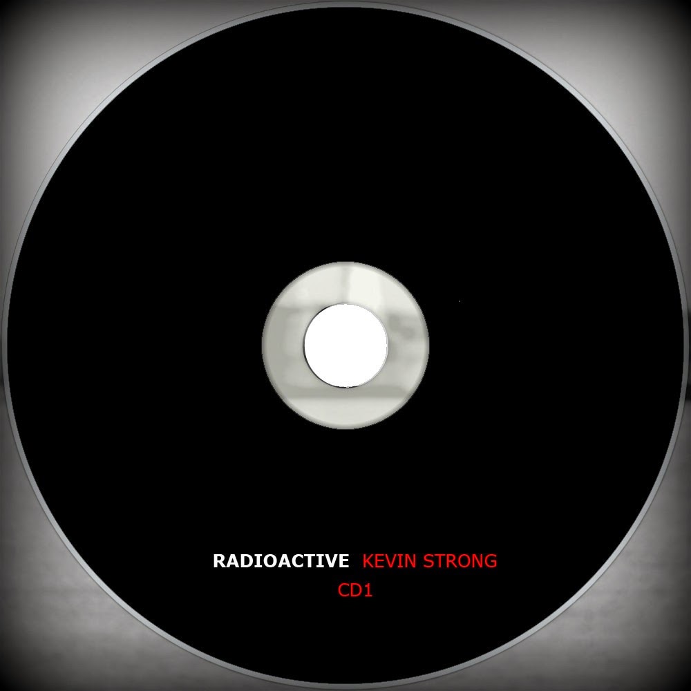
 I used the Adobe Photoshop CS5 in
order to achieve the planned effect of dark edgy tone on both of my CD’s. I
made them the same, including the name of an album which I chose before, “Radioactive”
with the name of the fake artist as I do not presenting the band. This is going
against the alternative rock conventions as mostly this music is played by the
band but in my case I decided to show one artist which could be seen as a
character as he is not signing in the video clip, and present him in the album
cover. I choose the actual name of my artist which is Kevin and added the
surname which would still in the memory of the audience Strong. The font style
which I chosen is simple and easy to read, as after analysing the variety of
album covers from this particular genre I liked the Fun album and One Republic
album, for its font style and the visual look. I am using the Verdena (regular)
font style which is different from the font that I used in the magazine and
album cover. I made that decision after trying numerous of fonts which did not
meet my requirement, as I wanted to create something delicate and smooth. I
make my both CD’s in black colour to don’t undermine the covers and inside
images of my album. Also, I decided that if I am using the dark and edgy tone
that would be most suitable in order to keep the continuity in between my
products. The background in which the CD’s are places are shady and misty, the
image I have used been taken from one of videoing sessions and present the
Humber Bridge Sea. I took that idea from exiting product after making my
research and planning.
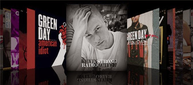
  In creating my digipak, I realise
that the most difficult aspect in achieving was to keep the continuity between
the images. On the other hand, I needed to ensure that the digipak linked the
magazine advert and music video as a whole. I portray my digipak in real life
setting by using real media products of iTunes shop. In order to achieved this
effect I needed to reduce the opacity under the front cover to create a real
product effect and to see how it would look like in between the real media
texts. I figure it out that it would be the simplest way of accessing my
product by audience as iTunes is the most popular media source used across the
world. Overall I think that my product meets the requirement and would be
effective in real life settings.


No comments:
Post a Comment